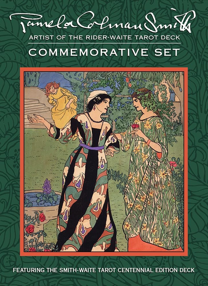
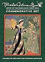
Pamela Colman Smith Commemorative Set
Product ID: 1529570
🃏78 authentic tarot cards
📚Comprehensive artist & guidebook
📦Durable double-box storage
23.50 OMR
1
Sold byAmazon OMANDelivered byDesertcartCustomer service byDesertcartReturns14 days · 30 with PRO
Buyer Protection · Full refund if your order doesn't arrive as described.
Desertcart purchases this item on your behalf and handles shipping, customs, and support to OMAN.
Secure transaction
Description
🃏 Own a piece of tarot history — shuffle tradition with style!
- MUTED VINTAGE PALETTE - Tasteful, antique-inspired color scheme that’s easy on the eyes and elevates your tarot readings with historic charm.
- TIMELESS TAROT TRADITION - Ideal for professionals and enthusiasts seeking the classic Rider-Waite-Smith experience without gimmicks or modern reinterpretations.
- COLLECTORS EDITION PACKAGING - Includes a sturdy double box, see-through protective bag, and exclusive art book celebrating Pixie Smith’s legacy.
- PREMIUM HANDLING SHUFFLEABILITY - Perfectly balanced card thickness ensures effortless riffle shuffles without sacrificing durability or feel.
- AUTHENTIC PAMELA COLMAN SMITH ARTISTRY - Experience the original 1909 Rider-Waite-Smith deck colors and details, faithfully reproduced for true tarot connoisseurs.
The Pamela Colman Smith Commemorative Set is a premium tarot deck replicating the original 1909 Rider-Waite-Smith artwork with muted vintage colors and high-quality card stock. This collector’s edition includes 78 shuffle-friendly cards, a detailed guidebook, an art book on Smith’s work, and a durable double box with protective bag. Perfect for tarot enthusiasts and professionals craving authentic, timeless tarot imagery and superior handling.


Specifications
| Asin | 1572816392 |
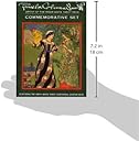
| Dimensions | 5.25 x 3.25 x 7.25 inches |
| Edition | Deluxe |
| Isbn 10 | 9781572816398 |
| Isbn 13 | 978-1572816398 |
| Item Weight | 2.7 pounds |
| Language | English |
| Print Length | 340 pages |
| Publication Date | April 29, 2009 |
| Publisher | U.S. Games Systems, Inc. |
Common Questions
Yes, all products are sourced directly from authorized retailers in the US, UK, UAE and India. We maintain strict quality control processes and verify each product before shipping. All items come with applicable manufacturer warranties and are covered by our standard return policy.
Delivery times vary by destination country, typically ranging from 3-9 business days. Each order is fully trackable through our system. We handle all customs clearance and use reliable courier partners for last-mile delivery. You'll receive regular updates about your order status via email and our app.
Desertcart is an international e-commerce platform operating since 2014. We securely process thousands of orders globally each day. Every product goes through our quality verification process before delivery, and we provide end-to-end order tracking, 24/7 customer support, and a comprehensive returns policy to ensure a safe shopping experience.
Our prices include the product cost, international shipping, import duties, customs clearance, and local delivery charges. We handle all customs and import procedures, ensuring there are no hidden fees upon delivery. PRO members receive additional benefits including free shipping.
Trustpilot
TrustScore 4.5 | 7,300+ reviews
Shop Global, Save with Desertcart
Value for Money
Competitive prices on a vast range of products
Shop Globally
Serving millions of shoppers across more than 100 countries
Enhanced Protection
Trusted payment options loved by worldwide shoppers
Customer Assurance
Trusted payment options loved by worldwide shoppers.
Desertcart App
Shop on the go, anytime, anywhere.