
DOWNLOAD THE APP


Customer Services
Copyright © 2025 Desertcart Holdings Limited
DOWNLOAD THE APP
Information Dashboard Design: Displaying Data for At-a-Glance Monitoring [Few, Stephen] on desertcart.com. *FREE* shipping on qualifying offers. Information Dashboard Design: Displaying Data for At-a-Glance Monitoring Review: A must read for anyone who works with dashboards / data visualization - If you spend any part of your work day looking at dashboards that don't seem quite right this book is a must read. This book is incredibly helpful for both dashboard creators and consumers. It has a permanent place on my bookshelf. As a mandatory textbook for a data course I was skeptical that a book on design was necessary. Boy was I wrong. After quickly reading it cover-to-cover I can definitively state this is a must have reference for anyone who utilizes dashboards. As someone who consumes dashboards regularly at work, the examples provided have served me well as I look to improve their usability. The book construction is as well designed and thought out as the content. The images & text are crisp, the pages are soft and smooth. While the book wouldn't make sense on an e-ink kindle, it would be great to have a digital version available if only to have a searchable version when referencing after the first read. Review: A Must-Read for Dashboard Designers - This is a really great book. It lays out in very understandable detail the principles of effective dashboard design. Few shows multiple examples of what not to do and approaches that should be followed. When designing a dashboard, start with Few's clear and concise definition and move on from there. The bottom line is that a dashboard should inform, with context, not distract with "bling" or chart junk, and fit on one screen. This is a tall order.
| Best Sellers Rank | #48,382 in Books ( See Top 100 in Books ) #11 in Information Management (Books) #11 in Data Modeling & Design (Books) #56 in Computer Science (Books) |
| Customer Reviews | 4.5 4.5 out of 5 stars (344) |
| Dimensions | 8.5 x 1.1 x 11 inches |
| Edition | Second Edition |
| ISBN-10 | 1938377001 |
| ISBN-13 | 978-1938377006 |
| Item Weight | 2.75 pounds |
| Language | English |
| Print length | 260 pages |
| Publication date | August 15, 2013 |
| Publisher | Analytics Press |
D**E
A must read for anyone who works with dashboards / data visualization
If you spend any part of your work day looking at dashboards that don't seem quite right this book is a must read. This book is incredibly helpful for both dashboard creators and consumers. It has a permanent place on my bookshelf. As a mandatory textbook for a data course I was skeptical that a book on design was necessary. Boy was I wrong. After quickly reading it cover-to-cover I can definitively state this is a must have reference for anyone who utilizes dashboards. As someone who consumes dashboards regularly at work, the examples provided have served me well as I look to improve their usability. The book construction is as well designed and thought out as the content. The images & text are crisp, the pages are soft and smooth. While the book wouldn't make sense on an e-ink kindle, it would be great to have a digital version available if only to have a searchable version when referencing after the first read.
K**E
A Must-Read for Dashboard Designers
This is a really great book. It lays out in very understandable detail the principles of effective dashboard design. Few shows multiple examples of what not to do and approaches that should be followed. When designing a dashboard, start with Few's clear and concise definition and move on from there. The bottom line is that a dashboard should inform, with context, not distract with "bling" or chart junk, and fit on one screen. This is a tall order.
R**R
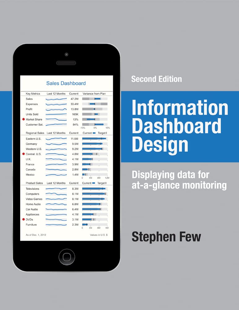
If you haven't read Few's other books, get it. Don't take the cover art too seriously, though.
Another good visualization book by Stephen Few, probably the most read thought-leader in dashboard visualization. I've read other books by Mr. Few, and his ideas are must-know ideas. You should buy this book NOW and read it cover-to-cover if you've not read his other similar works (or are not schooled in the similar ideas of Mr. Tufte). However, if you've read his prior work in this area, you probably have internalized the majority of this book as well and won't find significant new concepts in this edition. One note: based on the cover (an iPhone with a dashboard) I was excited to order this book on pre-order. I assumed the implication was that a significant portion of the book might be covering new form factors. In reality most of the book covers traditional full-sized PC dashboard design principles as prior books do. There are a few pages that discuss mobile device design, but mostly covering Mr. Few's opinions on dark vs. light backgrounds, but not much consideration specifically about mobile form factor design as I was hoping. Ovreall, great book, and if your work involves BI data visualization it's an important reference for your bookshelf. But if you already have several books by Few and/or Tufte you could skip this one.
D**A
BRAVO Stephen Few! For other readers, start here and read this book cover to cover.
I work in an area of the company where we have identified that we need dashboards, yet I feel like a fish out of water building them. It seems easy on the surface, but I've been down this road before. I know the general data I need to track, but I feel unsure where to put it, what graph to use, how to format it, have I even captured all the data? I've done dashboards in the past and thought "I don't really know, I'm just trying stuff...I guess??" I know there are good dashboards and bad. I run into them often. Yet, it's hard to discern what makes something good or bad. I have bought 7 data books over the past 6 months, throwing my head at this problem. I got this book today and was immediately sucked in and consumed half of it (and it's a really large book). I now feel empowered. All of my questions answered, one chapter at a time! This book towers over all of the other books combined I bought. Let me save you some time and money...start here and read this book cover to cover. I know it's hard cover and you really want a Kindle book. I did too. However, this book is absolutely worth the paper it's printed on. You won't be disappointed.
C**E
Helped me succeed in a job interview and get hired
This book has very practical tips on setting up your dashboard for success, like meeting with stakeholders to design requirements, and using the right chart for the right job. I found this book invaluable when I was applying for a new role, and it gave me tons to material to use in interviewing and starting new work.
I**R
One of the best books I've ever read period
One of the best books I've ever read period. Currently working as an analyst and needing to up my dashboard/design game when producing reports. This book is very informative and just plain well-written. Interesting facts and great examples. Not boring or dry whatsoever. Love it!
S**M
Content is top notch, the printed book isn't
I never write a review for anything but I just had to share that for a book that is so focused on the utility of design, the printing of the book is horrible. It looks like it was done with a 600dpi 1990s inkjet. The graphics are washed out and the screenshots are a joke. Don't get me wrong the content is very good but its a shame that the author chose this printer because they really are putting out a subpar product.
G**Y
Should be required reading for all designers
Stephen Few is THE best information designer in the industry. Lots of great examples and explanations. If you're just getting started, this will give you a base for future design decisions. If you're an experienced designer, like myself, you'll find a lot of information that will confirm your decisions, as well as new information to help you stay on top of your game.
B**N
This is a great practical book to help create simple, easy to understand dashboards for data presentation. A lot is common sense but only after you have seen it 1st. I now look at all those car dashboard type displays and sigh - knowing that the authors could have made them so much clearer if only they had bought this book.
R**A
Must have reference book if you would like to enhance your communication to the next level. Some of the visualization concepts presented in this book will make you to take a step back and challenge the conventional wisdom of preparing a cookie cutter Dash board or a presentation. One of the expensive books in my library but worth every penny. Stephen Few, you have got a new fan and a "Promoter" at the perceptual edge :-). Looking fwd to attend one of your workshops on visualization.
A**D
Un des meilleurs livres sur la visualisation de données que je eu l’occasion de lire. Beaucoup d’exemples de Dashboard qui ne fonctionnent pas (ou qui fonctionnent) en terme de présentation des données avec à chaque fois, les commentaires avisés de l’auteur. Par ailleurs, le livre est de très bonne qualité, ce qui n’enlève rien au plaisir de lecture.
M**O
La qualità di stampa di questo libro è pari a quella dei contenuti. Oltre a essere un testo di riferimento nel settore, la cura nel dettagli (grammatura carta, qualità di stampa, rilegatura) fa di questo libro qualcosa che è difficile rimpiazzare con un eBook.
D**L
O livro aborda o assunto de forma muito clara e completa. Possui dezenas de bons e maus exemplos coloridos. Ótima referência para criação de visualização de dados.
Trustpilot
1 week ago
2 weeks ago